
Dear Analyst #103: How to use one of the best features in PivotTables to filter your data (Slicers)
Podcast: Play in new window | Download
Subscribe: Spotify | TuneIn | RSS
I used to create a monthly 30-slide report and each slide had a different table or chart that I copied and pasted from Excel. As a naive analyst, I literally filtered my list of data using regular dropdown filters on each column to get the numbers I needed. I would filter, sum or average the data, and then enter the data onto the slide. It was super manual work. One benefit was I got really good at using keyboard shortcuts to filter a list of data. I didn’t realize that a PivotTable could easily automate my report. I could’ve built several PivotTables off of my raw data, stuck each PivotTable on an individual worksheet, filter each PivotTable to the data I need, and I’m done.

PivotTables continue to be one of the most important features in Excel, and in this episode I walk through how to use Slicers, one of the best features for filtering your data in PivotTables. You can download the Excel workbook used in this episode here. I also just launched a new Advanced PivotTable Dashboard class on Skillshare which I’ll talk about at the end.
Watch this episode to see a video tutorial on how to use Slicers in PivotTables
How to create a PivotTable using YouTuber data
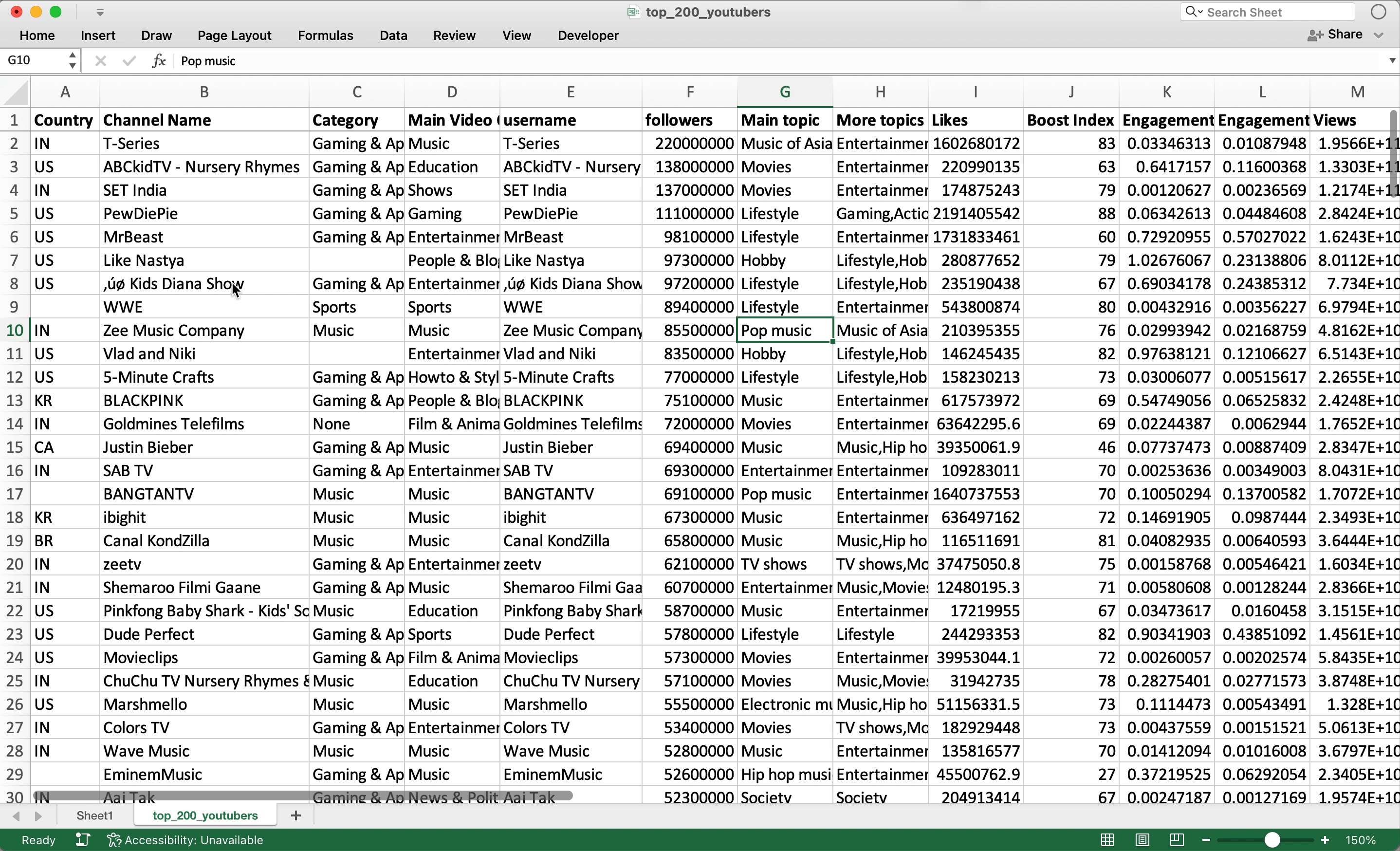
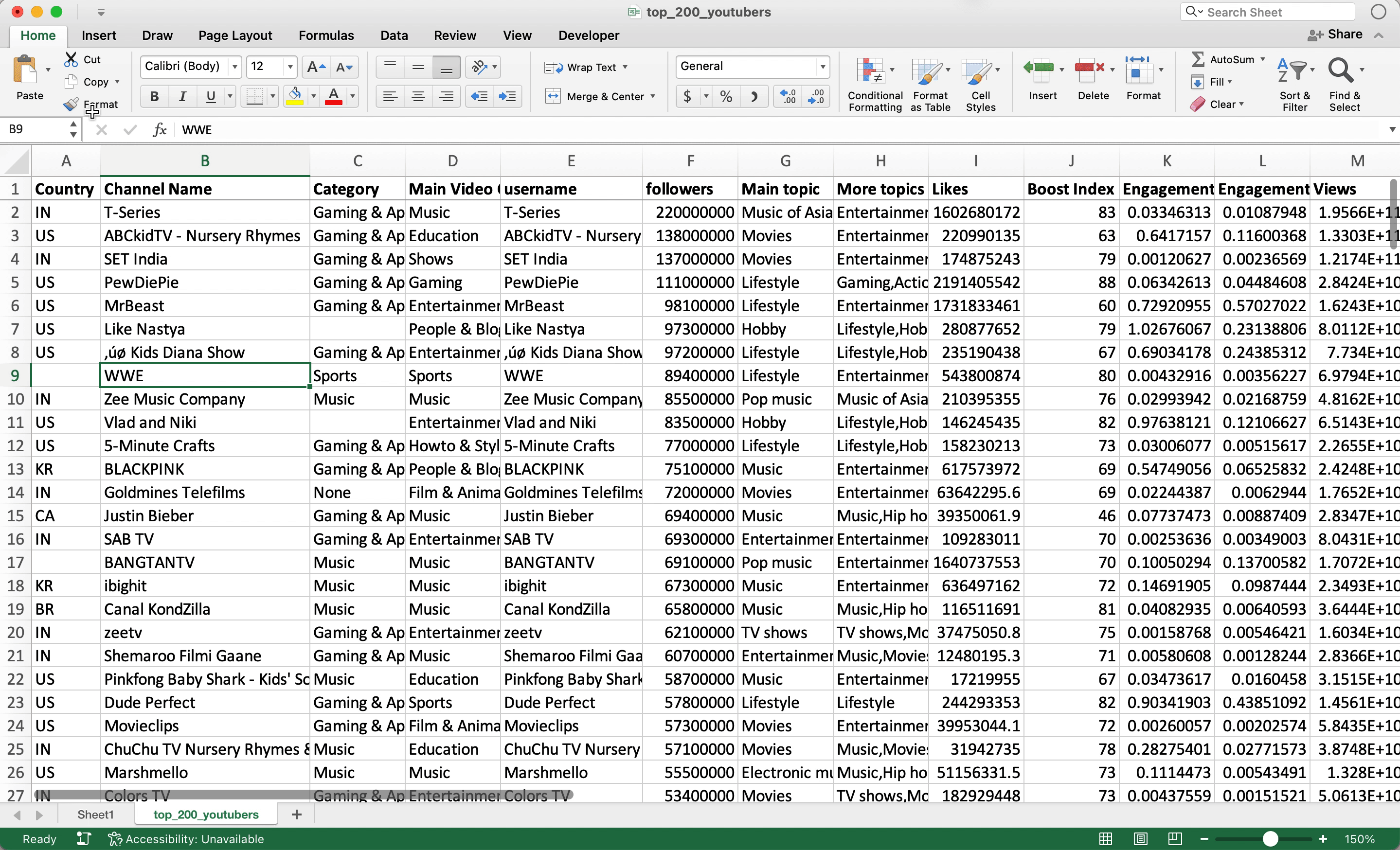
The raw data (download file for this episode) we we are using for this episode is a list of the top 200 YouTubers and data associated with their channels. Interestingly, I don’t recognize many of the channels on this list (or I just don’t watch enough YouTube):

Let’s create a PivotTable to better filter through this list of 200 YouTubers. It’s not a huge list but maybe we’d like a quick way to see the top channels in a certain country, category, etc. On a Mac Excel, the easiest way is to go to the Insert menu, click on PivotTable, and then hit OK. You can keep all the settings in the menu as is since we want to create a PivotTable on a new worksheet:
If you don’t want to start from scratch with building a PivotTable, you can have Excel suggest a PivotTable for you. Instead of clicking on the PivotTable button, click on “Recommended PivotTables” and you’ll see a worksheet get created with the PivotTable fields filled out:
Building out PivotTable with filters, rows, and columns
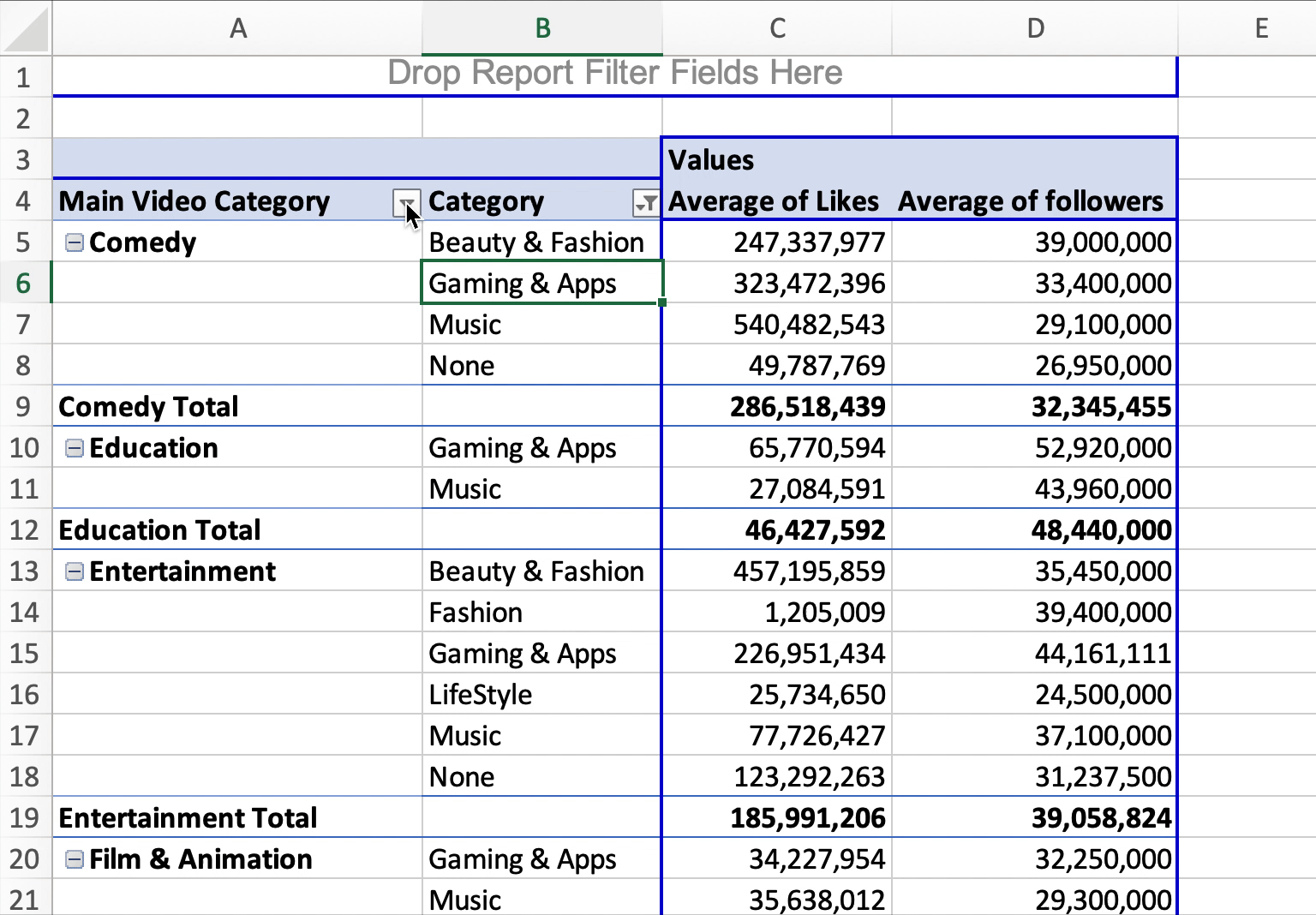
Let’s summarize our data in this PivotTable by finding the average number of Likes and Followers by Main Video Category and then Category. To set this up, your PivotTable fields should look like this:

The resulting PivotTable isn’t well formatted as you can see below:

A few things we can do to fix the formatting so this PivotTable is a bit more clear:
- Currently the Values show “Sum of Likes” and “Sum of followers,” and we want to change both of these Values to Average (since we want to find the average Followers and Likes)
- Give consistent formatting to the numbers so that there are commas in the thousandths place and no decimals
- Remove the “(blank)” option
- Change the layout of the PivotTable to the “Classic PivotTable layout”
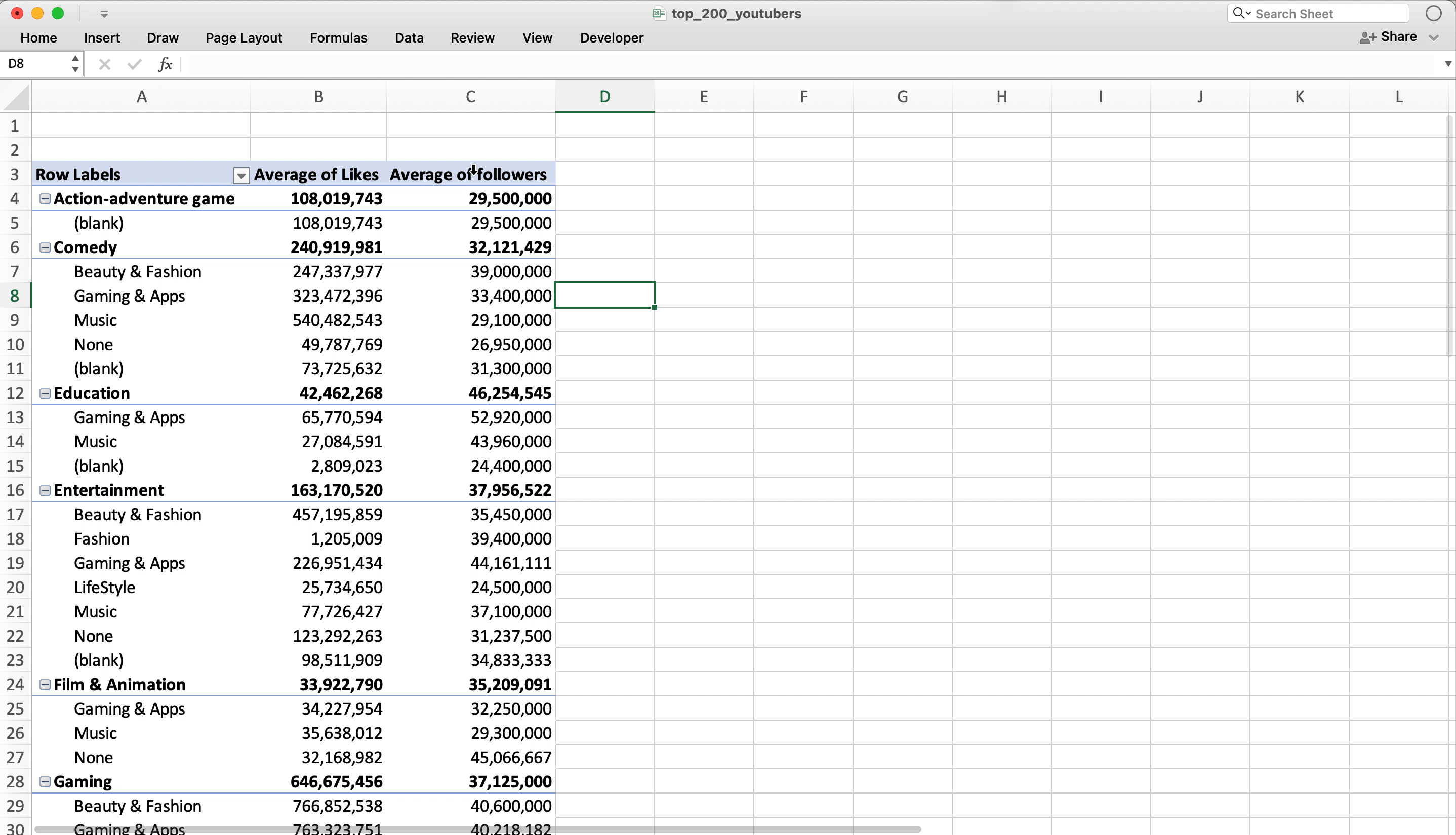
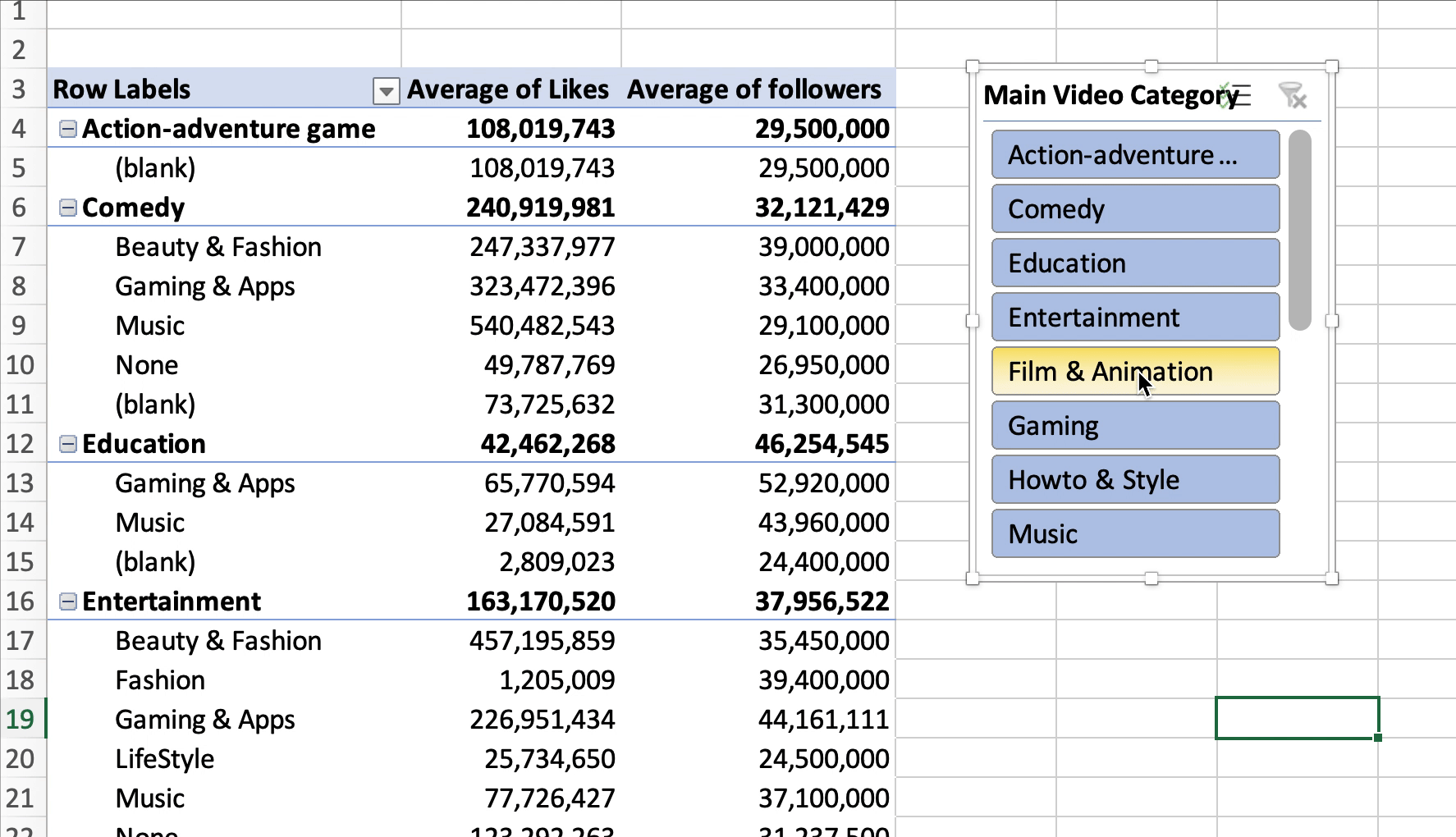
If you watch the video tutorial for this episode, you’ll see how to do all the above steps. The final PivotTable output from these formatting steps looks like this which is a little more usable than before:

A note about the classic PivotTable layout: it’s the best layout to learn from if you’re just getting started with PivotTables. If you look at the default PivotTable layout, you’ll notice it’s difficult to differentiate between the “Main View Category” and the “Category.” It’s actually really hard.
With the classic PivotTable layout, you can clearly see that you are first pivoting by the “Main Video Category,” and then by “Category.” The hierarchy is really clear. Setting the default PivotTable layout is so common that Mr. Excel himself wrote a blog post on how to set defaults for future PivotTables (applies to PC users only).
How to create an interactive Slicer for a PivotTable
If you want to filter the PivotTable to say the “Entertainment” Main Video Category, you could go through the dropdown menu in the header of the PivotTable like this:
If you’re trying to create an interactive dashboard with various PivotTable and PivotCharts, this isn’t a scalable solution and it’s not very user friendly. More importantly, you usually want to filter all your PivotTables and charts on a dashboard using the same filter. A Slicer in Excel is the exact feature we need to filter our PivotTables and charts. It’s like Slicers were built for dashboards in Excel.
To create a Slicer for our PivotTable for the “Main Video Category” column, we can follow these steps (for Mac Excel):
- Click on the PivotTable Analyze menu in the ribbon
- Click on Insert Slicer
- Then click on the column we want to build our Slicer for (“Main Video Category” in this case)
How to filter a PivotTable with a Slicer
Now that we have the Slicer, we can simply click on the value we want to filter the PivotTable by. If you click on “Entertainment,” you’ll see the PivotTable instantly filter to that Main Video Category:
You can also change the Slicer so that it allows you to select multiple values so that your PivotTable can be filtered by multiple options. You simply click on the checkbox icon in the top-right of the Slicer:

On the ribbon, there are a ton of different ways you can format your Slicer. One common formatting tip for Slicers is to put the selectable options into multiple columns to make the Slicer easier to use:

How to filter multiple PivotTables with one Slicer
The best part about Slicers is that you can filter multiple PivotTables and PivotCharts with just one Slicer. Like I said earlier, this is what makes Slicers the perfect feature for making an interactive dashboard. Your teammates and colleagues can now filter all the data and charts on a dashboard to the exact values they care about using Slicers.
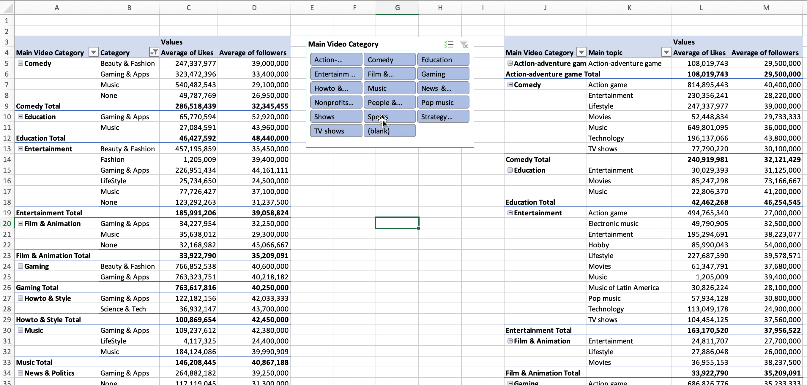
The easiest way to have a Slicer filter multiple PivotTables is to simply do a copy and paste an existing PivotTable on the same worksheet. It’s that simple. Just by doing the copy and paste, the existing Slicer on the worksheet will automatically get connected to the new PivotTable you created. Let’s go ahead and copy the existing PivotTable we created earlier and move it to the right of the Slicer we created:

You’ll see we have a replica of our original PivotTable starting in column J. For the sake of this example, let’s remove the “Category” field from our new PivotTable and add in the “Main Topic” field instead. Your new PivotTable should now have “Main Video Category” and “Main Topic” in the Rows fields:

Now try clicking on various Main Video Categories in the Slicer and notice how it filters both PivotTables at the same time:
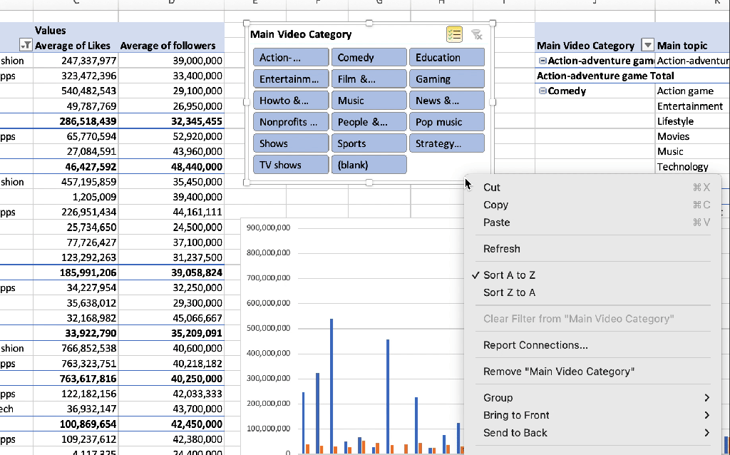
I inserted a PivotChart based off of the first PivotTable, and the Slicer also filters that PivotChart! Now you can see how powerful the Slicer is for making your dashboard more interactive:

How to disconnect a Slicer from filtering a PivotTable
A natural question to wonder about Slicers is can you disconnect a Slicer from a PivotTable? You absolutely can. On a big dashboard, you might have multiple Slicers that are filtering different parts of your dashboard.
When you right-click a Slicer, there’s a “Report Connections” options which let’s you disconnect a PivotTable from one or several PivotTables. In this case, we only have two PivotTables connected to our “Main Video Category” Slicer:
You’ll notice that the name of our two PivotTables in this example are “PivotTable1” and “PivotTable6.” When you’re copying and pasting PivotTables, Excel automatically assigns these generic names to your PivotTables. You should give your PivotTables unique names so that it’s clear which PivotTable you are connecting and disconnecting from a Slicer.
If you want to rename a PivotTable, click on the “PivotTable Analyze” menu in the ribbon, and in the left-most part of the menu, you’ll see a form to enter the PivotTable Name:

New advanced PivotTable class for creating a dashboard
As I mentioned earlier, I recently launched a brand new advanced Excel class on Skillshare called Advanced PivotTable Techniques for Creating a Cohesive Dashboard. You’ll learn how to use features like Slicers to create an interactive dashboard that your teammates can use to make better business decisions. I had a lot of fun digging into some advanced PivotTable features and I hope they help you analyzing and visualizing data better!

Other Podcasts & Blog Posts
In the 2nd half of the episode, I talk about some episodes and blogs from other people I found interesting:
- Against the Rules with Michael Lewis: Six Levels Down


Trackbacks/Pingbacks
[…] to export the backlog to a CSV and then they can go off into Excel and do their custom reporting, PivotTables, and dashboarding to show how the product and eng team’s work aligns with the rest of the […]