
Dear Analyst #86: One Important Excel Feature to Know to Do Your Best Data Analysis
Podcast: Play in new window | Download
Subscribe: Spotify | TuneIn | RSS
Nothing like a click-baity headline to get your spreadsheet emotion all riled up amirite? Earlier in my data analysis career, I thought knowing advanced Excel formulas and writing macros made you a good analyst. If you’ve been following this podcast/newsletter, you’ve probably discovered that there is no one magic Excel feature that automatically makes you a good data analyst. The key to good data analysis is a soft skill: asking good questions (see this episode with the co-founder of Mode, Benn Stancil). Having said that, there is one Excel feature that I learned early in my career that really helped me improve my data analysis: PivotTables. Why PivotTables and what features about PivotTables make them so good for data analysis? Read on for more. You can also download the Excel file used in this episode here.

Video tutorial of this episode:
1. Getting data to look right for PivotTables
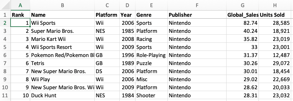
This is a requirement for PivotTables that also teaches you important lessons about how to structure your data. It’s tempting to see a long list of data and just say “throw a PivotTable on it!” and not think through if the PivotTable will actually “work.” What I mean by this is that the underlying source data has to be laid out correctly in order for you to do any type of exploratory data analysis on your data set. Take this common layout of data you might see in a PowerPoint presentation or some deck (video game sales):

You have years (or some time period) along the columns and then some measure in the rows. Perfectly fine table of data for seeing sales, in this case, for different video game companies. Now there are a ton of other companies and devices to report on, so maybe for the purposes of data analysis, you want to put this into a PivotTable. Once you do that, this is what the PivotTable settings look like:

Not super useful for quickly seeing sales trends by year, seeing which devices had the most sales, etc. You have to “drag in” each year into the Columns field to see the actual sales.
Transforming and massaging the summary table
To make this data look right, it requires a bit of manual massaging of the data. There are ways you could automate this with a macro, but it’s important to understand why the data should look this way before you “throw a PivotTable” on the data:

A few things to note about this dataset:
- Years are no longer across the top in the columns. It’s just one column with the value being the year itself.
- The sales metric is also its own column and not spread out across columns.
Given that more data you’re analyzing is coming from databases, data will most likely be structured like this to begin with. But when you’re manually aggregating data from reports or other sources in Excel and need to get it into a format ready for PivotTables, this is the transformation you need to do in order for it to look right for data analysis.
2. Doing deeper data analysis after you spot a trend
One of the main benefits of PivotTables is being able to do quickly do exploratory data analysis. You can easily drag-and-drop columns from your original data table to look into trends and see if it’s something worth digging deeper into.
For instance, let’s say with out video game sales dataset, we want to see which platforms were trending in the early 1990s:

As you can see, SNES (Super Nintendo) has a clear lead in terms of global sales from 1990-1995. It is interesting to see PS (PlayStation) make a splash in the market in 1994 and 1995. That $35.92 number in 1995 is quite interesting. It beat out SNES sales and is more than 5X the previous year’s sales. Which games contributed to that sales number in 1995? Which video game publishers created those games for PlayStation?
You can double-click into the number in the PivotTable and literally dig deeper into the individual rows that “make up” that number. This is one of my favorite feature of PivotTables and is essentially like finding a trend and being able to query your database to find the specifics:

After you double-click, a new worksheet gets created showing you the underlying rows that make up the $35.92M number. The table that shows up might have many rows so you may need to filter and sort it a bit to further look for the answers to your data analysis questions. Doing a quick sort shows that the top games sold in 1995 on PlayStation were Namco Museum Vol. 1 (Sony), Tekken (Sony), and Rayman (Ubisoft). Ahh this brings back memories:

3. Create your own calculations for data analysis
When you work with a dataset that has many columns, you will probably have many facts and metrics that your company tracks. This is usually sales, number of customers, or orders. This is typically the column you drag into the “Values” field of the PivotTable:

If your data looked like the table above, the two columns you would drag into the “Values” field in the PivotTable would most likely be Quantity and Unit price. You would only care about these columns because you want to be able to answer questions like:
- In which year did we sell the lowest quantity of products?
- What was the average unit price for cookies?
- Which customer purchased the most products?
What if your dataset doesn’t contain the metric you’re looking for? If we go back to our video game sales data, you’ll notice we have a Units Sold column, but what if I wanted to see what the average retail price was by year?
The quickest solution you might think about doing is simply adding another column to your source data called Average Sales Price and just divide the sales by units sold:

You never want to manually create any totals, averages, or other summary metrics in your source data. I’ll repeat that again: don’t create any totals or averages in your source data. If you do this and then throw on a PivotTable, the metrics won’t be accurate as you slice and dice your data in the PivotTable.
One of the benefits of PivotTables is you can create your own calculations if one doesn’t exist yet (like the Average Sales Price in our video games sales example). These are called Calculated Fields in Excel. Calculated fields are dynamic because as you drag in columns from your source data, the calculated field will change just like any other metric you have in your source data. In our video games example, we are creating a calculated field for average sales price by taking the current total sales, multiplying it by 1,000,000 (since our sales is in $M), and dividing it by the Units Sold column:

👉 Learn more about PivotTables for data analysis
I have to shamelessly plug an advanced PivotTable course I created last year where you can learn some of the tips and tricks mentioned in this episode. I’m planning on producing more advanced PivotTable courses and publishing them later this year on Skillshare since I think they are an invaluable tool for data analysis. If you are looking to increase your skills with PivotTables, give the course below a look:

Other Podcasts & Blog Posts
In the 2nd half of the episode, I talk about some episodes and blogs from other people I found interesting:
- The Jocko Podcast #310: Relish The Struggle and Keep Reaching For The Stars. With Jose Hernandez
- ShopTalk Show #494: WYSIWYG Follow Up, Open Source Maintenance, Micro-Frontends, and Fleet vs GitHub Copilot vs VS Code


No comments yet.