
Dear Analyst #98: How a career in graphic design helps you with data storytelling and visualizations with Wacarra Yeomans
Podcast: Play in new window | Download
Subscribe: Spotify | TuneIn | RSS
When you’re working in a marketing or advertising agency, you’ll work with clients across various industries. The data you analyze will also vary client to client, giving you exposure to various datasets and the business logic that drives these datasets. Wacarra Yeomans started her career as a graphic designer in the agency world. She always had a knack for building empathy for the end consumer. This empathy would drive how she approached her designs. People assumed Wacarra didn’t “know” data given her design background. She quickly saw how her creative ideas could lead to clicks, engagement, and conversions in the classic marketing funnel. This led her to want to build up her data skills, use her design skills in her data visualizations, and eventually creating a fun product for Excel nerds :).

Building customer profiles with Excel, Google Sheets, and more
One of Wacarra’s current projects is building customer profiles and journeys. Wacarra works at Showpad, a sales enablement platform. She’s essentially looking at tones of Salesforce data to build out these customer journeys. A customer journey tells the story of how a potential customer interacts with your product or service. You analyze how much customers spend, where they work, etc. As Wacarra dug deeper into Salesforce and other data sources, she realized she could combine different data points about companies together.

Outside of Salesforce, Wacarra looked at NPS score and product usage data. The unique identifier was simply the company name. Since there wasn’t hundreds of thousands of rows of data, Wacarra united everything in Excel. From there, she built PivotTables with calculated fields to view the company data differently. She also mentioned a Salesforce Google Sheet add-on which allows you to pull Salesforce data directly into Google Sheets.
Once the data analysis was done in Excel, Wacarra’s design skills came into play. She created PDF versions of all the customer journeys and profiles to make the data visualization nicer. Being able to communicate the findings from the data is a huge part of the data analysis process. Wacarra loves the data storytelling aspect of her job because it blends her creative and data skills together.
What is the impact of these customer profiles and journeys? One data point she brought up during our conversation is that she was able to show all the different software and platforms customers are using. This helped the product team prioritize certain integrations in the Showpad platform. When new hires join the company, they can quickly understand who Showpad’s target customers through these visualizations. Data about the customers is just one side of the story. Customer profiles typically blend quantitative and qualitative data to tell a story about the customer.

Data storytelling through Excel files with 250+ tabs for Abercrombie & Fitch
When Wacarra was in the agency world, one of her clients was Abercrombie & Fitch. As an “experience strategist,” her goal was to advise Abercrombie & Fitch on how to improve the customer experience. She was essentially creating a different form of user journeys for her client.
Abercrombie & Fitch was working with a research vendor who would send the raw data about Abercrombie & Fitch’s customers to Wacarra’s agency. The data was in Excel, and each file had over 250 tabs for Wacarra to analyze. Each tab/worksheet was a different research question with all the answers from customers on the worksheet. Wacarra was technically on the UX team, but she worked closely with the data analytics team at her agency. To analyze all the data, Wacarra thought she could do everything in Python. Alas, Excel ended up being the tool of choice.

Predicting customer actions with a driver analysis
In order to build out the customer journeys and predict how Abercrombie & Fitch’s customers might act in the future, Wacarra and her team conducted a driver analysis. A driver analysis looks at a variety of variables and factors to predict some outcome variable. It’s similar to NPS with the main difference being that an NPS analysis is usually at the customer service level. A driver analysis gives you a more complete picture of your customer and how they will act.
The ultimate deliverable to Abercrombie & Fitch was a data story showing the customers experience from beginning to end. There were 9 customer segments and the analysis showed Abercrombie & Fitch that they didn’t know their customers as well as they think they did.
For instance, Wacarra brought up a data point showing that moms were buying Hollister apparel for themselves (and not their teenage kids). During her interviews with Abercrombie & Fitch store managers, Wacarra found that a late 20s/early 30s Hispanic persona was shopping at the store. The data further proved that the qualitative research was true. It’s always fun when the data matches up with reality.

Wacarra’s team didn’t know what to expect when sharing their findings with Abercrombie & Fitch. As data stewards, Wacarra’s job is to simply present the data. If there were outliers in the data, Wacarra would bring this up with the client. You never know when an outlier may become the trend. Even if the business if focused on one strategy, the outliers in the data may help steer the ship in the right direction.
Building data skills through a free data science bootcamp
As Wacarra began to build up her data skills, she realized formal training with credentials would help her transition fully into the world of data. She enrolled a free data science bootcamp called Correlation One. This data science bootcamp is unique in that they aim to create a more diverse data ecosystem by providing free training for underrepresented communities (e.g. Black, LatinX, female, LGBTQ+) through their Data Science for All program.
When Wacarra applied to the program, there were 24,000 applicants. 1,000 were admitted, 700 did a pre-bootcamp exercise in Python, and 600 students ultimately finished the program. Wacarra recalls meeting a diverse group of students including doctors, college students, and more.
Many bootcamps dive right into learning Python, SQL, or Excel. Wacarra remembers the first hour of a lecture being about how to understand the problem. Often times analysts will jump right into the analysis, but the final output answers the wrong or irrelevant questions. Once these softer skills are taught, the lectures would dive into Python, SQL, and the Seaborn data viz library (this library was also mentioned in episode #34 with Sean Tibor and Kelly Schuster-Paredes).

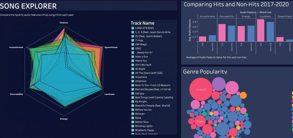
Predicting the next Billboard hit with audio features from Spotify
During the data science bootcamp, Wacarra worked on a project to help predict if a song would be a “hit” using Spotify’s API and SDK. For each song in Spotify’s expansive library, the API gives you 12 key features about each song. Some of these features include danceability, energy, liveness, and more. To help predict if a song would be popular, Wacarra’s team used Billboard data. By uniting these two datasets, the team was able to predict with 70% accuracy whether a song would show up on the Billboard list.
The first step was cleaning the data from Spotify. For instance, many of the scores from Spotify’s API had decimal points. The team had to normalize all the scores across all songs. The team then did t-tests to find correlations between the two data samples. Wacarra recalls watching the StatQuest YouTube channel to learn how to apply statistics to her project.
Wacarra mentioned some interesting findings and learnings from her project:
- Accuracy: Originally her team thought they could predict with 100% accuracy whether a song would show up on Billboard. The teaching assistants for the bootcamp told her this wasn’t possible. It turns out the Baby Shark song was skewing the doo doo data (sorry had to do it).
- The Weeknd: Turns out The Weeknd is a really great group. They produced hits every year in the dataset Wacarra analyzed.
- Upbeatness & Energy: Certain features from Spotify’s API had a high impact on whether the song became a hit. Upbeatness and Energy, unsurprisingly, are two features with positive correlation with being a hit. A feature that has a negative correlation is the Acousticness of the song.
In addition to these findings, Wacarra created a Tableau dashboard to tell a story about the Spotify and Billboard data:
Advice for analysts: understand the problem
We ended the conversation discussing Wacarra’s advice for analysts and what’s she’s learned throughout her career. Reiterating the lessons she learned from her data science bootcamp, she recommends analysts understand who you are creating the analysis for and how your target audience will use your analysis.
In a lot of roles, we think about “how to do it” versus “should we do it?”
This quote speaks to the urge to dive right into the data and start using the tools we love. Wacarra’s advice is to step back and question whether the analysis should be done in the first place. This softer side of data analytics has been brought up several times on the podcast (see episode #71 with Benn Stancil, founder of Mode).
You should also feel like you have a stake in the analysis you produce since you are the de factor voice of the customer. The findings may have an emotional impact on your target audience since you are ultimately telling a story using data to drive the twists and turns in the plot. Wacarra suggest reading Ruined by Design by Mike Monteiro which helps creatives understand the emotional impact products can have on people. Finally, to become better at creating data visualizations, you should consider taking a design class to understand colors, contrast, and more.

Spreadsheets and bed sheets
To show her love of Excel spreadsheets (and her design skills), Wacarra created a product called Spreadsheets Bedsheet. It’s exactly what you think it is: a bedsheet full of cells. The product is no longer being sold, but they sure do look classy:

Not to be confused with Spreadsheet to Bedsheets: Simplify your finances, Transform relationships, Dream with confidence. Who said Excel spreadsheets can’t have an emotional impact on you and your significant other?

Other Podcasts & Blog Posts
No other podcasts mentioned in this episode!


Trackbacks/Pingbacks
[…] you acquire in the data world, Ryan reiterated that storytelling (something we’ve heard over and over again on this podcast) is the most important skill to […]