
Dear Analyst Episode #116: Will Microsoft’s AI Copilot for Excel replace the need for analysts?
Podcast: Play in new window | Download
Subscribe: Spotify | TuneIn | RSS
This news is a bit old but I figured it’s juicy enough to talk about its future implications on Excel and artificial intelligence in general. Mid-March 2023, Microsoft announced Copilot, it’s artificial intelligence bet that will supposedly change the way we work. The video discusses how Copilot integrates with Office 365 and all your Microsoft apps including Excel. Around minute 18:00, they show a demo of how Copilot helps you find trends, make adjustments to your models, and more. It’s quite impressive. You can watch just that segment from the presentation below. I watched the video a few times and wondered: will Copilot eliminate the need for entry-level data analysts? Only time will tell.
Breaking down the features in Copilot for Excel
This is the corporate marketing blurb from the Microsoft blog post announcing Copilot for Excel:
Copilot in Excel works alongside you to help analyze and explore your data. Ask Copilot questions about your data set in natural language, not just formulas. It will reveal correlations, propose what-if scenarios, and suggest new formulas based on your questions—generating models based on your questions that help you explore your data without modifying it. Identify trends, create powerful visualizations, or ask for recommendations to drive different outcomes. Here are some example commands and prompts you can try:
- Give a breakdown of the sales by type and channel. Insert a table.
- Project the impact of [a variable change] and generate a chart to help visualize.
- Model how a change to the growth rate for [variable] would impact my gross margin.
The video shows the above 3 bullet points using a dataset of product sales by country:

Finding key trends with Copilot for Excel
The first demo involves giving Copilot a prompt like “analyze the data and give me 3 trends.” The output is something you might expect if you’ve done anything with ChatGPT:

This feature in Copilot is table stakes and a version of this came out in Google Sheets in 2017. The Explore panel in Google Sheets can provide similar summary trends on your data and suggest charts you should add to your analysis. Google Sheets has slowly been adding AI-like features over the last few years, so don’t sleep on Google Workspace’s own AI announcement. Below is a dataset of hotels and their locations and I simply clicked on the Explore option in the bottom-right of the Google Sheet:

The trends don’t come in a free-form text format but the different widgets are interesting. The first widget shows additional questions you might ask of your dataset (and Google Sheets spits out the answer). Then the most common visualizations like Pivot Tables and charts are displayed afterwards which makes it easy to analyze and visualize your data. This leads into the next feature in Copilot for Excel: visualizing your data.
Visualizing your data with Copilot for Excel
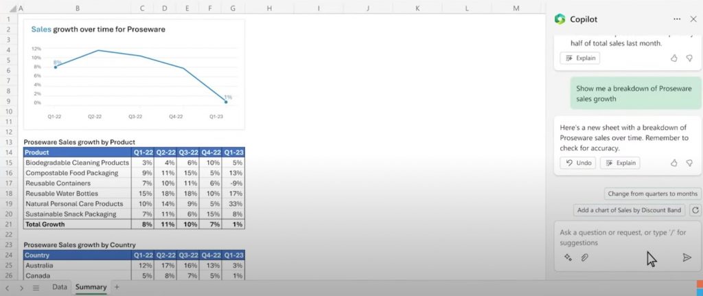
What’s old is new. As I explained in the previous section, Google Sheets’ Explore panel already has a flavor of this feature. The next prompt for Copilot is “Show me a breakdown of Proseware sales growth.” Yes, it’s natural language. Yes, humans are lazy and it’s easy just to ask a question in plain English and get an answer back. But the summary and data and charts already exist in Google Sheets. This just happens to be Excel’s implementation of the Explore feature and the AI is the entry point to this feature:

I like Copilot responds to the prompt by saying:
Remember to check for accuracy.
That doesn’t inspire much confidence in you, Copilot! Nonetheless, Copilot does a few things that are interesting:
- Created a chart with a title and the title has selective formatting (assuming the AI made the “Sales” word foreground color green)
- The tables are nicely formatted with clear headers, formatted percentages, and growth rates
- The background colors for all the cells are white (common formatting trick for making your visualizations stand out more)
- Columns are re-sized to fit the width of the products and the growth rates
- Column A and Row 1 are very narrow in width and height, respectively (another common trick to making dashboards look cleaner)
Was this all AI or just smoke and mirrors?
It’s hard to say which of the above formatting operations were done by the AI versus a human who just cleaned up the spreadsheet for a demo.
Does the AI know that a summary table looks better when the background color cells are all white?
Does the AI know that analysts like to make column A and row 1 super narrow/short so that the charts and tables are flush against the edges of the spreadsheet?
If Copilot knew all this, that’s pretty slick. But this just so happens to be the vanilla formatting you’ll see in a dashboard devoid of any custom coloring or branding. It will be interesting to see how an analyst would train Copilot to create visualizations that match the theme and brand guidelines for existing reports.
The next prompt is “Help me visualize what contributed to the decline in sales growth?” The interesting leap that Copilot makes here is translating a very simply business question into a feature (conditional formatting to highlight what contributed to the decline):
But simply applying conditional formatting to a table of numbers is not nearly as impressive as all the formatting steps the AI did in the previous step to create the table in the first place.
What-if scenario analysis with Copilot for Excel
This is probably the most interesting part of the demo. The next prompt is:
What would have happened if Reusable Containers had maintained the prior quarter’s growth rate?
Before Copilot, you’d have to start thinking about duplicating your summary table and start setting up cell references to replace the current growth rate with another number. Assuming this is not some human playing around with data for the demo, Copilot does the whole thing for you:

What’s impressive is that Copilot was able to copy the original summary table and paste it directly to the right of it. This makes comparing the growth rates easy. It was also able to change the title to reflect the answer to the original prompt. Finally, the step-by-step bullet points tell you exactly what Copilot did to create the analysis.
Perhaps this type of analysis is “easy” for Copilot since you have a relatively simple summary table with clearly spelled out products and growth rates. What if there are more variables involved or there are other one-off factors that would impact the analysis? According to the longer Copilot demo, Copilot has access to the full corpus of data for your organization so it should have the domain expertise that someone who works in the business knows. This means you could ask Copilot questions whose answers are tucked away in some Outlook email, Teams thread, or PowerPoint slide. That’s pretty freaking cool.
The question still remains: Will Copilot replace the need for data analysts?

If the analysis is as simple as what Microsoft showed in this demo, I think the answer is yes.
If you’re an entry-level analyst, this type of task is not very uncommon. You have dataset where you need to build summary tables and put them into PowerPoint decks to present during meetings. Your manager tells you: “Hey, what would growth look like for Reusable Containers if we didn’t completely tank last quarter and used historical growth rates?” You would probably follow a similar step-by-step process as the above screenshot shows. Copilot appears to be able to do the basic analyst grunt work and format the analysis in a clear visualization.
Why Copilot won’t replace analysts at large enterprises
While Copilot does look impressive, it definitely won’t replace human data analysts who understand nuance, context, and business knowledge at large enterprises. If you are a startup and building a model from scratch, Copilot might be a good solution to get something off the ground and running. The Microsoft demo clearly shows that this is possible. I can foresee a few situations where Copilot would not be used in a large enterprise:
- A lot of money is on the line – The Copilot prompt already tells you to “check for accuracy.” If you are working on a multi-million dollar deal, you best be sure you have a human taking a look at the numbers.
- Company culture may not be captured in Microsoft applications – As much as our knowledge is “written down” in Word, Outlook, and Teams, there is a lot that is not formally written down in these applications. Humans understand the nuances about company culture and how that can impact the analyses and dashboards analysts create.
- Existing templates have already been created – In a large enterprise, you are most likely copying an existing file to build a model or dashboard. That institutional knowledge has resulted in well-formatted dashboards where Copilot may not add much value (if formatting is a big part of the task).
Long story short, I’d love to see Copilot tackle a more complicated task that can’t be solved with a simple template. If you’re well versed in Excel, doing what this demo did by “hand” might take all of 15 minutes and you build the knowledge on how to do this analysis in the future. This knowledge makes debugging and troubleshooting models easier.
Other Podcasts & Blog Posts
In the 2nd half of the episode, I talk about some episodes and blogs from other people I found interesting:
- People Make Games – We Entered the World of Microsoft Excel eSports & Got Our Asses Beat


No comments yet.