
Dear Analyst #91: Growing Peloton’s product analytics team and growth funnel experimentation at Superhuman with Elena Dyachkova
Podcast: Play in new window | Download
Subscribe: Spotify | TuneIn | RSS
I first heard Elena speak on another podcast and was shocked to hear an analyst talk about one of the biggest companies to emerge during the pandemic: Peloton. Someone from the inside, as it were, is talking about topics that Peloton would likely want to keep confidential. Due to PR and the restrictions that come with an NDA, Elena couldn’t come on the podcast to talk about the data projects she was working last year. A few months ago, Elena became a principal data scientist at Superhuman, and is now able to share a little more about her experience at Peloton. As an avid user of Peloton’s bike and app, I was extremely excited to dig into the types of projects Elena was working on that shaped Peloton’s product roadmap. We get dive into the world of product analytics at Elena’s former employer and at her current gig at Superhuman.

Joining Peloton as the first product analyst in 2018
Hard to believe, but Peloton was just a bike company when Elena first joined the company. Peloton was working on the Tread product at the time but it hadn’t been released. The product team wanted to make more data-driven decisions to help inform what product features to build next. There was an existing business intelligence team who was building reports around sales and marketing campaigns, but no product analysts were there to help guide the product roadmap. Elena was hired in 2018 to help build a practice around product analytics.

Surprisingly, Elena didn’t really have direct product analytics experience. In her previous roles, she was more of a product owner and did things more akin to a product manager. It was an opportunity for Elena to define the purpose of the product analytics team and how they interacted with the rest of the business.
Answering data questions from the business
As one might imagine, the product team at Peloton is asking what features might increase repeat engagement on the app. It was Elena’s job to answer these type of questions. Like many organizations, the analytics function will get inundated with questions and Elena found herself with a backlog of important questions to answer.

As Peloton grew, so did the number of questions. Elena started hiring a team and was leading the process for how questions get asked, who gets to ask these questions, and how the product analytics team engages with internal stakeholders. Elena eventually grew the product analytics team to 14. As the analytics team grew, Elena had to maintain a ratio of product managers and analysts as the product analytics manager.
Elena mentioned a few resources that helped her with learning about product analytics, engagement, and user activation:
- Sequoia Capital’s “Building Data-Informed Products” Medium posts – Learn about growth accounting, stickiness metrics, and how to build a data team
- Amplitude’s Blog – Amplitude also happens to be the main product analytics vendor at Peloton
- Reforge’s Product Management courses – Paid course used by a lot of Silicon Valley product managers
Establishing cross-functional KPIs and metrics definitions
In addition to getting asked data questions, Elena’s team was in charge of building dashboards showing stats about product usage and metrics. This series of events might also sound familiar to many of you who spend your days building dashboards in Mode, Looker, or Amplitude:
- Executives ask you to create a dashboard looking at 20 different metrics
- You and your team go off and build the dashboard
- You present the nice shiny dashboard to the executives
- Executives say they would like to see the dashboard cut and sliced in another 20 different ways
- Repeat steps 1-4 every few months

The above process is obviously not sustainable.
It takes a special type of person to step back and detach from the everyday humdrum of data requests and re-define what the product analytics team does. During this planning phase, this person also needs to take on the monumental task of getting alignment on metrics definitions.
Elena’s strategy was to tie the KPIs to Peloton’s product strategy. Feels like common sense for a company that produces hardware and software products right? But this goes deeper than answering the question: what’s on our product roadmap for next quarter?
The bigger questions to answer include what is the mission of our product? What are our users’ beliefs about our products? We’re getting into the realm of user research and feedback. But if there are KPIs to be established, you best believe that your users should be a big factor.
Breaking down Peloton’s metrics and KPIs
Elena’s team utilized the North Star framework in order to create KPIs everyone could agree on:
The North Star Framework is a model for managing products by identifying a single, crucial metric (the North Star Metric) that, according to Sean Ellis “best captures the core value that your product delivers to [its] customers.”
–Amplitude Blog
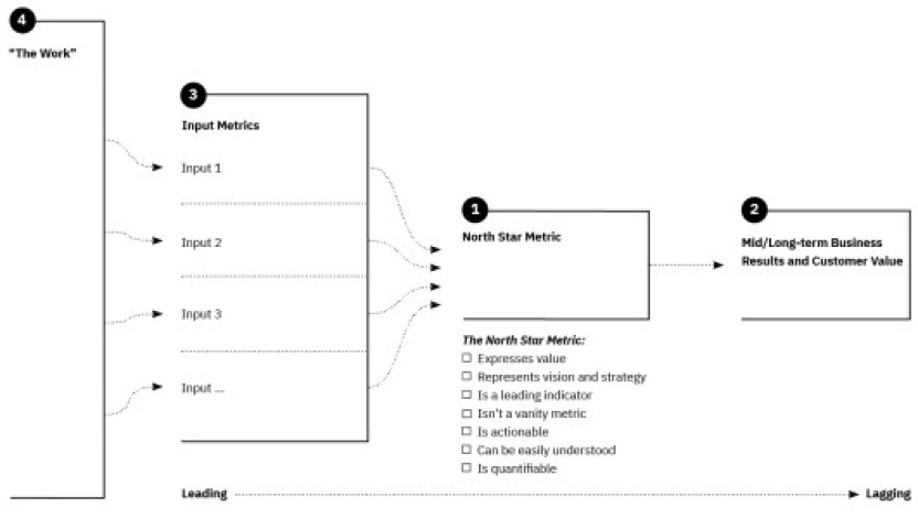
What I like about this framework is that it combines both leading and lagging indicators to to help your team figure out if you are driving customer value and getting at your team’s North Star.
Elena put together a cross-functional team consisting of engineering, product, and design leaders. During this phase, no dashboards were shown. The goal was to simply brainstorm on what these input metrics might be.
For instance, Peloton’s regular paid users would be a leading indicator in this model for revenue. As stated earlier, other input metrics related to how you might keep users engaged with the bike and app. Other metrics Elena’s team looked at:
- User acquisition
- Growth funnels
- Free to paid user conversion rate
I discovered a few things about the word of product analytics from talking with Elena:
- The metrics may not necessarily directly lead to dollars. The KPIs are pointing at the North Star of increasing user engagement.
- KPIs are different from OKRs. KPIs are “health” metrics for how the product is doing. OKRs are quantifiable goals based on the company’s big strategic bets.
Doing data exploration on non-bike exercises or fitness disciplines
For those new to Peloton, there are many other exercise modalities than biking. Running, strength, and meditation are just a few of the other exercise “disciplines” Peloton offers to its members. It was interesting hearing Elena use the word “discipline” since I happen to come across this word when doing my own data exploration of Peloton’s API.

One data exploration Elena’s team did was looking into exercise variety. The question to answer:
Does pushing notifications of other types of fitness disciplines to the member result in higher retention?
If you’re someone who always uses the bike or only does strength classes, would being suggested a running exercise lead you to come back to the app more? Seems like an important question to answer since it leads directly to Peloton’s North Star metric. It also seems important given Peloton’s investment in the content and instructors for all these other fitness disciplines.
The result? Suggesting a second fitness discipline did, in fact, help with increasing retention. But suggesting that the member doing a different fitness discipline every day was not beneficial at driving retention.
For all you active Peloton members out there, I’m sure you have a bunch of other ideas Peloton could do for improving user retention and overall stickiness. As armchair analysts, we can only come up with hypotheses. But Elena’s former team (and the broader product team) are able to conduct tests on its million of members and get quantifiable results. It’s like having the power to change the font or color in a Google search page to see if it leads to more searches and clicks.
The grand-daddy tool for dashboarding: Google Sheets
As we were discussing the culmination of Elena’s KPI and metrics definitions, Elena brought up that Google Sheets was the tool of choice for data visualization. You’d think with all the advance data viz tooling out there that Peloton might use some fancy vendor for this cross-functional KPI dashboard. Spreadsheets will never die. I had to dig deeper into this fancy dashboard in Google Sheets.

I’m always fascinated by large companies who continue to use spreadsheets for non-accounting/finance purposes. Elena is a big fan of the customization of Google Sheets (as am I). She was using the Looker API to push data into Google Sheets. The dashboard also had some basic week-over-week changes, conditional formatting, and sparklines. At the end of the day, Elena felt the Google Sheets dashboard was easier to share and more customizable than Peloton’s internal BI tool.
The reason for deferring to Google Sheets was also a resourcing issue. Elena’s team didn’t have the data engineering help to build out the backend and dashboard in their BI tool. From a permissions perspective, Google Sheets is also “unbreakable” since you can have the source data in one Google Sheet and use the IMPORTRANGE() function to import that data into another Google Sheet. Your colleagues and mess up the data in that target Google Sheet, but the raw source data is unscathed.
- Free spreadsheets and citizen developers: 1
- Expensive data viz software: 0
Onboarding flows and growth funnels at Superhuman
Elena left Peloton earlier this year after being inspired by some of her direct reports. She saw all the analytical tools and techniques her reports were working on like Bayesian theory and causal inference, and wanted to become an individual contributor again. She started learning tools and frameworks like dbt, and eventually became a principal analyst at Superhuman.

Superhuman is a paid email app known for their keyboard shortcuts. They are also notoriously known for their onboarding process where you have to do a 30-minute “coaching session” in order to start using the app.
Unlike Peloton, Superhuman doesn’t have all the self-serve analytics tools for internal stakeholders. This means the marketing and support teams are asking Elena for custom analysis and reports. Internally, Superhuman is using Metabase which isn’t as self-serve as other analytics tools.
The North Star metric at Superhuman? A smooth and delightful experience during the onboarding process. These days, Elena does a lot of SQL writing and and experimentation on the onboarding specialist funnel. They tested removing a long survey that the user receives during the onboarding process since it didn’t add to a smooth and delightful experience.
Advice for aspiring data analysts
We ended the conversation with advice for new data analysts and what Elena looks for in resumes. Elena said this is the number one skill a data analyst should have:
Be able to take a vague problem statement and break it down into metrics and inputs.
Other soft skills include curiosity and tenacity. I think over-indexing on the soft skills will help you long-term. Most people who want to get into a data role can take classes or training programs to get better at Excel, SQL, and Python. Being able to tell a story about the data and constantly ask questions to find the truth are tougher skills to acquire.

Elena also brought up an important distinction between small startups and large companies (something Santiago Viquez also brought up in episode #88). At early-stage companies, having the technical skills will be more important since there most likely won’t be many learning opportunities internally. You’ll be expected to hit the ground running. You’ll be a generalist and defining your own problems, gathering the data, and rounding up the stakeholders.
At a large company, you’ll have tons of mentorship opportunities and chances to learn. When I started off as a financial analyst at a big company, we went through the same 10-day Excel training that consultants and bankers receive when they start their new careers.
Other Podcasts & Blog Posts
No other podcasts mentioned in this episode!


Trackbacks/Pingbacks
[…] trucks, and other vehicles. They would deliver insights from this data back to the customer. The North Star goal is to reduce the costs per kilometer by any means […]
[…] quickly saw how her creative ideas could lead to clicks, engagement, and conversions in the classic marketing funnel. This led her to want to build up her data skills, use her design skills in her data […]
[…] joined Uber Eats in late 2016 right when Uber Eats had found product-market fit. As a product analyst, one of Ryan’s first projects was figuring out the ROI from the investments Uber Eats was […]